

Form Fields: Less Is More
Every field you add drops your conversion rate. Here's how to cut the fluff and keep what matters.
What goes where on your first 600 pixels matters more than you think. We break down the winning formula.

You've got roughly 600 pixels before people scroll. That's it. Everything above the fold is real estate you can't waste, and we've seen it done right — and wrong — thousands of times. The difference? It's not magic. It's strategy.
Most sites pack too much up there. A headline, a subheading, three value propositions, a call-to-action, maybe a form. Everything fighting for attention. Your visitor doesn't know where to look, so they look away. Then they're gone.
The sites that convert? They're ruthlessly simple about it. They answer one question: Why should I care? Everything else comes later.
Editorial Team
Written by the ConvertFlow Strategy editorial team, focused on practical, tested guidance for building high-converting landing pages.
Your headline has one job. Not three. Not five. One.
It's either going to tell people what you do, or it's going to stop them from scrolling. Most sites try to do both at once and end up doing neither. You've probably seen them: "Leading Digital Solutions for Enterprise Growth" or "Innovative Marketing Technology Platform." Meaningless.
The winning formula? Be specific. Tell them exactly what they get. "Design Landing Pages 10x Faster" beats "Revolutionary Design Platform" every time. People don't want revolution. They want their problem solved.
Test it yourself. Take your current headline and replace every buzzword with something concrete. If your headline could describe ten different companies, it's not working hard enough. It should describe yours, specifically.
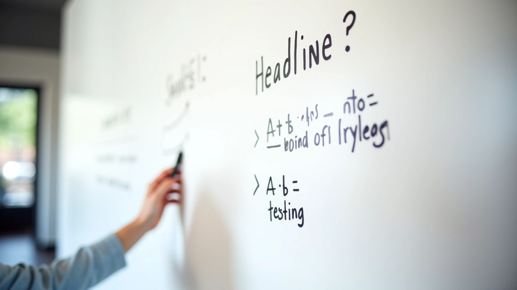

After your headline lands, you've got about 3 seconds to prove it's worth staying.
That's what your subheading does. It's not decoration. It's not another chance to sound clever. It's the proof that your headline isn't lying. If your headline says "Cut Design Time by 50%," your subheading better explain how or why that's actually possible.
The best subheadings we've seen do one of three things: they expand on the promise, they prove it with a number, or they remove a doubt. "Save 10+ hours per project with our template library." That's all you need. It tells them what, gives them proof, and removes the "yeah right" feeling.
Don't make it longer than two lines. Don't use words like "seamlessly" or "innovative." Just be clear. That's enough.
Here's what nobody talks about: the spaces are more important than the stuff.
Padding. Margins. Whitespace. These aren't decorative. They're how you guide eyes. They're how you make things scannable. A cramped above-the-fold section reads like chaos. Breathing room reads like confidence.
Most sites cram 40% too much into their hero. Text too small, too crowded, buttons squeezed next to images. People see it and think "too much to deal with." Then they leave.
The layout we recommend above the fold? Headline at top (40-48px), with 20-30px of space below it. Subheading in 18-20px. Another 20-30px. Then your primary CTA button, with 30-40px breathing room around it. On mobile, bump those spaces down proportionally. Nothing feels tight. Everything feels intentional.
Your CTA button isn't just decoration. It's the moment someone decides to commit.
Most buttons are too small, too pale, or say something too vague. "Learn More" doesn't tell people what happens when they click. "Start Free Trial" does. "Get Started" tells them nothing. "Create Your First Landing Page Free" tells them everything.
Size matters. On desktop, your button should be 16-18px font with 14-16px vertical padding. It should be clearly visible without dominating the entire hero. Color matters too — contrast is everything. If your background is light, use a bold, dark color. If it's dark, bright and bold works.
And placement? Center it or align it left with the text. Don't float it to the right trying to look modern. Centered CTAs convert better. Tested fact.
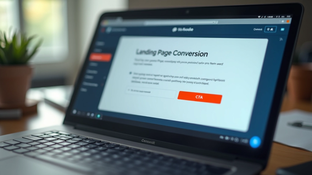
You don't need to guess if your above-the-fold layout is working. Test it.
Take a screenshot of your hero section. Show it to someone who's never seen your site. Ask them: "In three seconds, what does this company do and why should I care?" If they can answer both questions, you're winning. If they're confused, your layout needs work.
The winning formula is simple: clear headline, proof in the subheading, breathing room everywhere, and a button that tells them exactly what happens next. It's not flashy. It's not trendy. It's effective. And that's what actually matters.
Start with one thing: look at your headline right now. If it could describe five different companies, rewrite it to be specific to yours. That one change will improve everything below it.
This guide is educational and informational in nature. Layout principles and design recommendations are based on general best practices and testing methodologies. Results vary depending on your specific audience, industry, and offer. We recommend testing these principles with your own traffic and iterating based on your data. Every website is unique — use these guidelines as a starting point, not a formula.
Every field you add drops your conversion rate. Here's how to cut the fluff and keep what matters.

The right button in the right spot changes everything. We've tested it. Here's what works.
Over half your visitors are on mobile. Your page needs to work for them first, everyone else second.